I stated working on making this site dynamic.
Things that will be added:
- the ability to publish your own solutions
- the ability to vote/downvote solutions
- the ability to comment on solutions
Challenge 1 [Solution]
A solution by RGgt
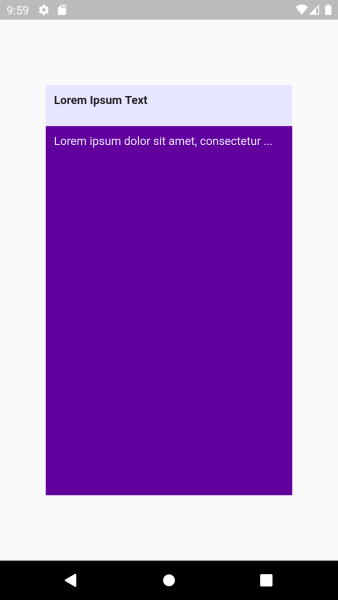
To implement this design, we will need to place 2 widgets, one on top of the other. One widget will be a simple box with a white background; the other widget will have a purple background and will later be clipped to give the wave-like appearance.
For simplicity, I will initially use some hard-coded values for sizes.
import 'package:flutter/widgets.dart';

class WaveWidget extends StatelessWidget {
  const WaveWidget({Key? key}) : super(key: key);

  @override
  Widget build(BuildContext context) {
    return Stack(
      children: [
        // The white box
        SizedBox(
            width: 300,
            height: 500,
            child: Container(
                color: const Color.fromARGB(255, 230, 230, 255),
                padding: const EdgeInsets.all(10),
                child: const Text("Lorem Ipsum Text",
                    style: TextStyle(fontWeight: FontWeight.bold)))),
        // The purple box
        Positioned(
          bottom: 0,
          child: SizedBox(
            width: 300,
            height: 450,
            child: Container(
                color: const Color.fromARGB(255, 98, 0, 158),
                padding: const EdgeInsets.fromLTRB(
                    10, 10, 10, 10),
                child: const Text(
                "Lorem ipsum dolor sit amet, consectetur ...",
                style: TextStyle(color: Color.fromARGB(255, 230, 230, 255)),
                )
            ),
          ),
        ),
      ],
    );
  }
}
The result will look like this:

Now we need to click the purple box and give it the wave-like aspect.
To do that, we will wrap its Container element (which is actually painted purple) in a ClipPath widget, to which we will provide a custom clipper.
        ...
        // The purple box
        Positioned(
          bottom: 0,
          child: SizedBox(
            width: 300,
            height: 450,
            // Wrap the container inside a ClipPath
            child: ClipPath(
              // And provide a custom clipper
              clipper: MyClipper(),
              child: Container(
                  color: const Color.fromARGB(255, 98, 0, 158),
                  padding: const EdgeInsets.fromLTRB(
                      10, 10, 10, 10),
                  child: const Text(
                  "Lorem ipsum dolor sit amet, consectetur ...",
                  style: TextStyle(color: Color.fromARGB(255, 230, 230, 255)),
                  )
              ),
            ),
          ),
        ),
        ...
Our custom clipper will extend CustomClipper<Path> and override getClip and shouldReclip.
In shouldReclip we only need to tell Flutter if we want to apply the clip again. As in our first implementation of the clipper, we will have no parameters, so it is ok to always return false for now.
The interesting part is getClip, where we will define a Path that will give the container the wave-like shape.
In fact, the Path that you return from this function will actually represent the area of the clipped control that you want to be visible. Anything that will be outside the path will be clipped out.
By default, a path starts at the (0,0) point, but we need to start at a bit lower, at the base of the first wave. So, if the wave height is 25, we first need to move the starting point to (0, -25).
From there, we need to draw a curve line for the first wave. This wave should end at (width/2, -25) and from there will start the second wave, which will end at (width, -25).
These two waves will be defined using the quadraticBezierTo function. The first two parameters of this function define the control point, while the last two define the ending point of the curve. You will need to experiment with the control point for a bit, as it will not be “a point on the curve.” Rather, it will act as a sort of magnet.
After you have defined the two waves, the only thing left is to include the rectangular part below them in the path.
For this, we use the simple function lineTo.
class MyClipper extends CustomClipper<Path> {
  MyClipper();

  @override
  getClip(Size size) {
    var path = Path();
    // Move the the base of the first wave
    path.moveTo(0, 25);
    // The first wave (oriented upward)
    path.quadraticBezierTo(size.width / 5, -25, size.width / 2, 25);
    // The second wave (oriented downward)
    path.quadraticBezierTo(5 * size.width / 6, 3 * 25, size.width, 25);
    // Bottom-Right of the Container
    path.lineTo(size.width, size.height);
    // Bottom-Left of the container
    path.lineTo(0, size.height);
    path.close();
    return path;
  }

  @override
  bool shouldReclip(MyClipper oldClipper) {
    return true;
  }
}
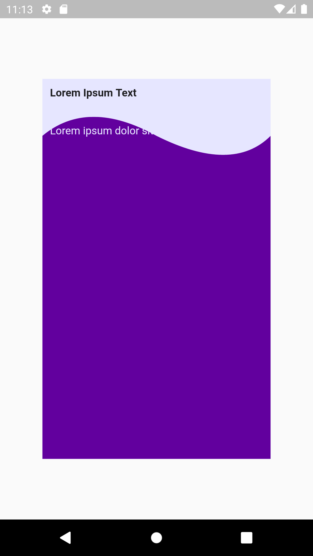
The screen is starting to look as it should.

The first obvious issue is that the text is also partially clipped out. To fix this, we need to change the padding of the purple rectangle so that its content is placed below the lowest point of the second wave.
So keeping the wave height hard-coded as 25, the code becomes:
        ...
        // The purple box
        Positioned(
          bottom: 0,
          child: SizedBox(
            width: 300,
            height: 450,
            child: ClipPath(
              clipper: MyClipper(),
              child: Container(
                  color: const Color.fromARGB(255, 98, 0, 158),
                  padding: const EdgeInsets.fromLTRB(
                      10, 10 + 2 * 25 /* account for waves height */, 10, 10),
                  child: const Text(
                  "Lorem ipsum dolor sit amet, consectetur ...",
                  style: TextStyle(color: Color.fromARGB(255, 230, 230, 255)),
                  )
              ),
            ),
          ),
        ),
        ...
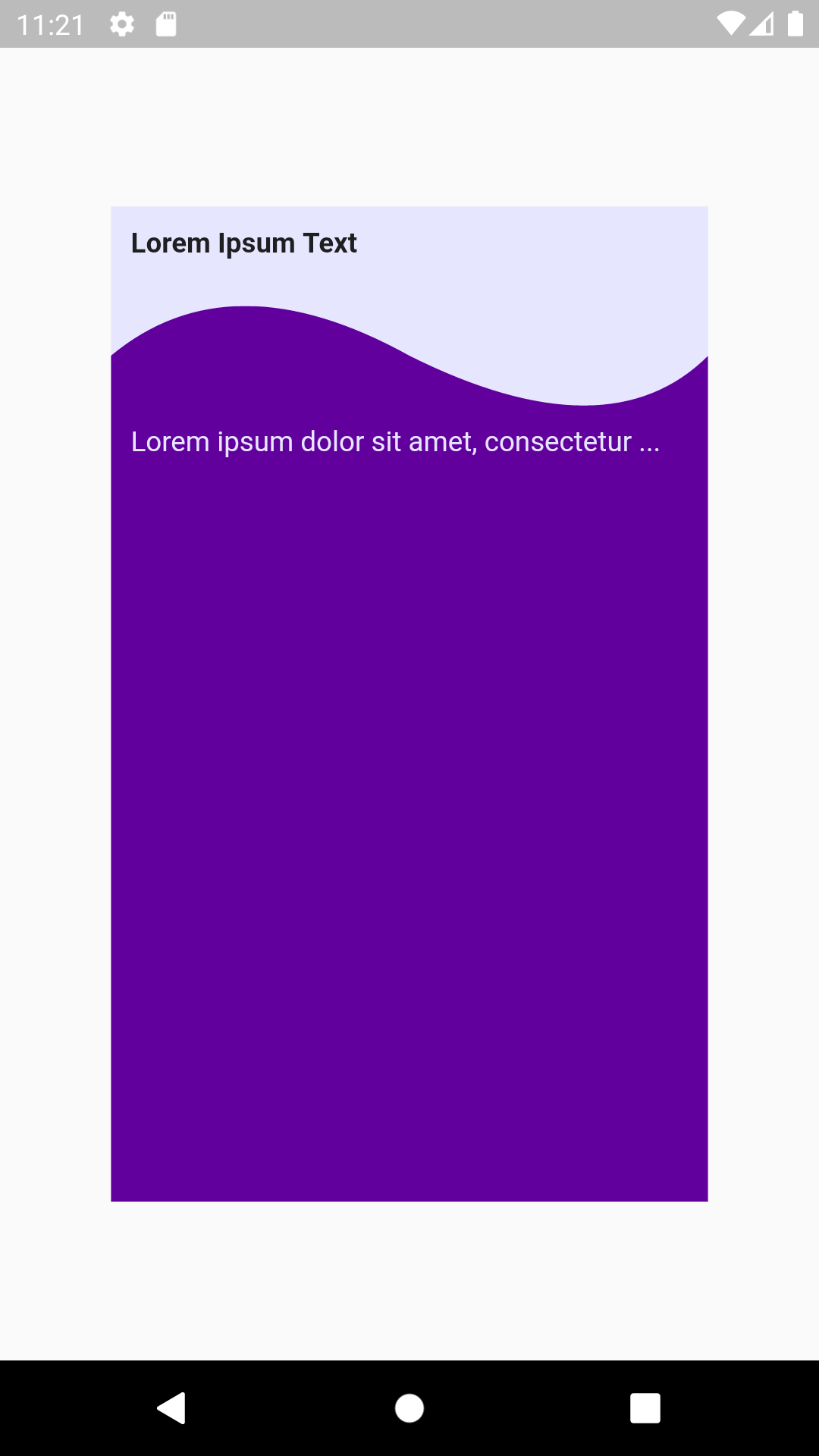
At this point, we have a functional screen that looks like it should.

The next step will be to replace all hard-coded values with parameters, but this is mainly simple Flutter programming. I will not do this here as it will needlessly complicate the code. So before concluding, let’s take a final look at the complete code that deals with the main aspect of the challenge:
import 'package:flutter/widgets.dart';

class WaveWidget extends StatelessWidget {
  const WaveWidget({Key? key}) : super(key: key);

  @override
  Widget build(BuildContext context) {
    return Stack(
      children: [
        // The white box
        SizedBox(
          width: 300,
          height: 500,
          child: Container(
            color: const Color.fromARGB(255, 230, 230, 255),
            padding: const EdgeInsets.all(10),
            child: const Text(
              "Lorem Ipsum Text",
              style: TextStyle(fontWeight: FontWeight.bold),
            ),
          ),
        ),
        // The purple box
        Positioned(
          bottom: 0,
          child: SizedBox(
            width: 300,
            height: 450,
            child: ClipPath(
              clipper: MyClipper(),
              child: Container(
                color: const Color.fromARGB(255, 98, 0, 158),
                padding: const EdgeInsets.fromLTRB(10, 10 + 2 * 25, 10, 10),
                child: const Text(
                  "Lorem ipsum dolor sit amet, consectetur ...",
                  style: TextStyle(color: Color.fromARGB(255, 230, 230, 255)),
                ),
              ),
            ),
          ),
        ),
      ],
    );
  }
}

class MyClipper extends CustomClipper<Path> {
  MyClipper();

  @override
  getClip(Size size) {
    var path = Path();
    path.moveTo(0, 25);
    path.quadraticBezierTo(size.width / 5, -25, size.width / 2, 25);
    path.quadraticBezierTo(5 * size.width / 6, 3 * 25, size.width, 25);
    path.lineTo(size.width, size.height);
    path.lineTo(0, size.height);
    path.close();
    return path;
  }

  @override
  bool shouldReclip(MyClipper oldClipper) {
    return true;
  }
}
Summary
1. We created a Stack with the white widget at the bottom and the purple one on top.
2. We added a ClipPath wrapper to the purple widget and supplied it with a custom clipper.
3. In our custom clipper, we returned the area that we wanted to remain visible, and everything else was cut out. We experimented with the control point of the Bezier curves until we were pleased with the visual result.
Now all that is left is to replace the hard-coded values with parameters.
See the basic solution on DartPad
See a slightly more polished impementation of the solution on DartPad